A Forgettable Investor Leave-Behind
*Identifying information has been changed.
The Problem
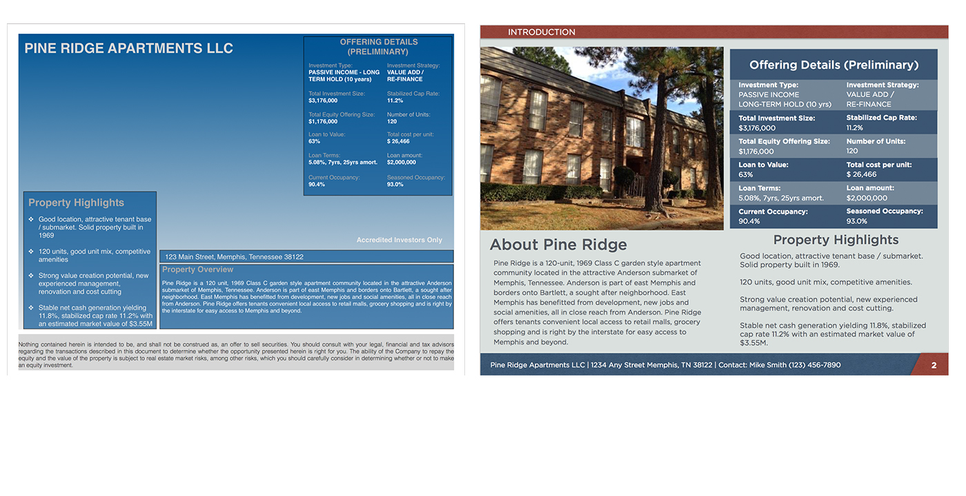
The client, a startup real estate syndicate*, was looking for new investors in a multi-family housing unit. However, their presentation did not reflect the property’s value or their professionalism. They needed to share a large amount of information without overwhelming their prospects.

Click the image to see before & after
What We Did
This presentation’s impact was limited by a few core issues. We addressed each individually.
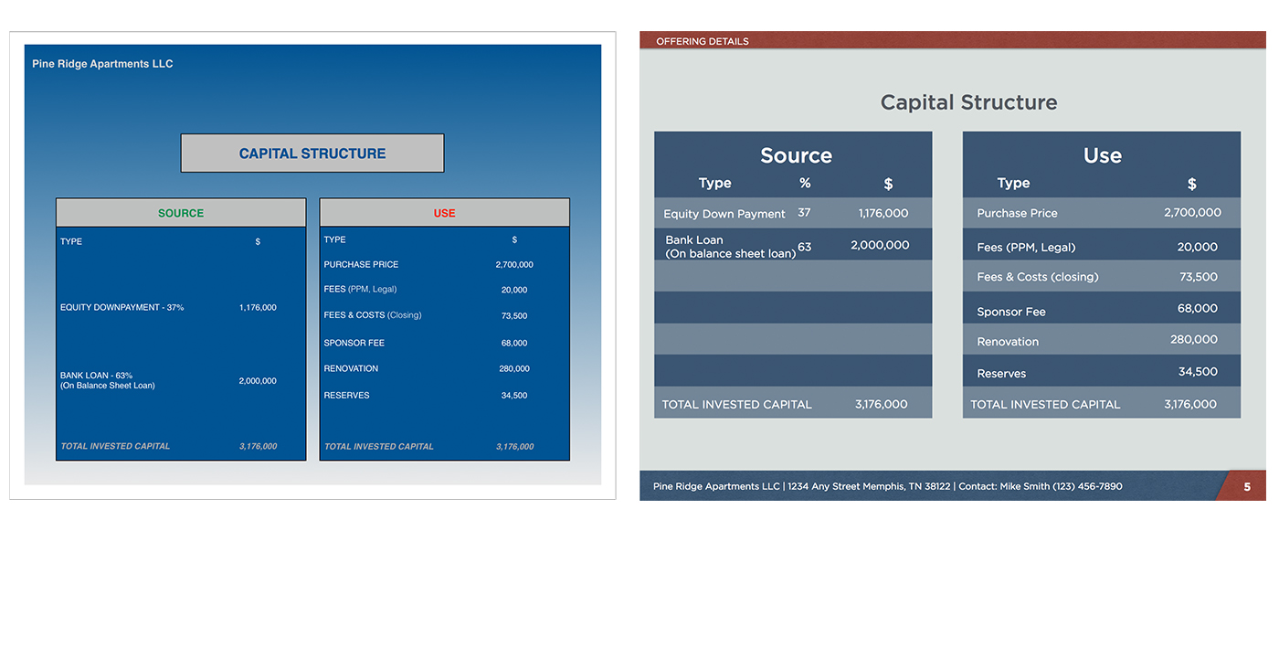
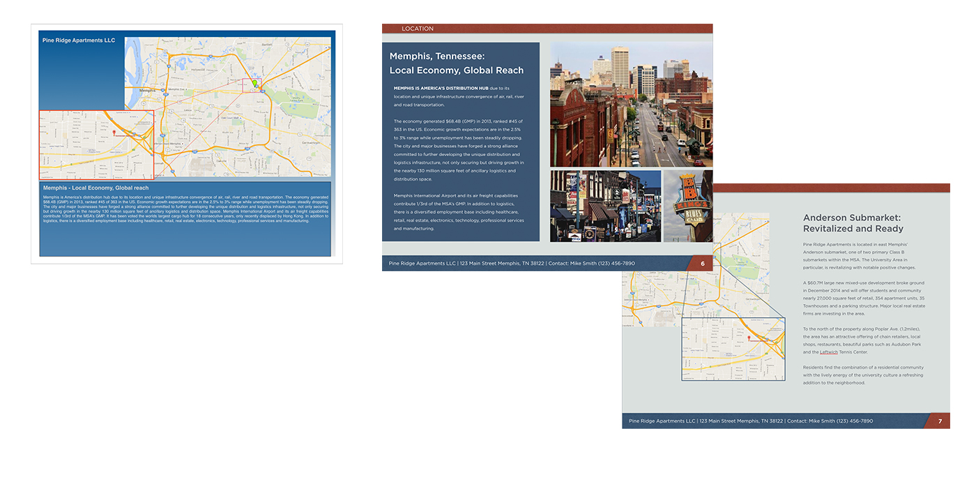
- Too much information in a compact space. By trying to keep page count low, content was stuffed onto every page. As a result, it was difficult for the reader to find and digest important points. The Solution: We expanded the the page count. Now the presentation had a smoother flow and more white space. Consequently, information became easier to review and reference.
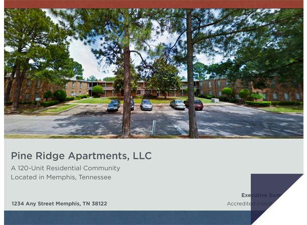
- Too little imagery. Important financial information and spreadsheets were a featured part of the presentation. However, this sacrificed the aesthetic and emotional value of photography. The Solution: Including photos of the building and city helped readers establish an emotional connection to the property and the project.
- No deliberate brand signifiers. Because the syndicate had just launched, the client had not yet established a color palette or signature brand elements. Therefore, the presentation was not memorable. The Solution: We presented multiple industry-acceptable options that reflected their professionalism. In the end, the client chose the “U.S.A”-inspired color system.